CLIENT
Westernacher Solutions
ABOUT
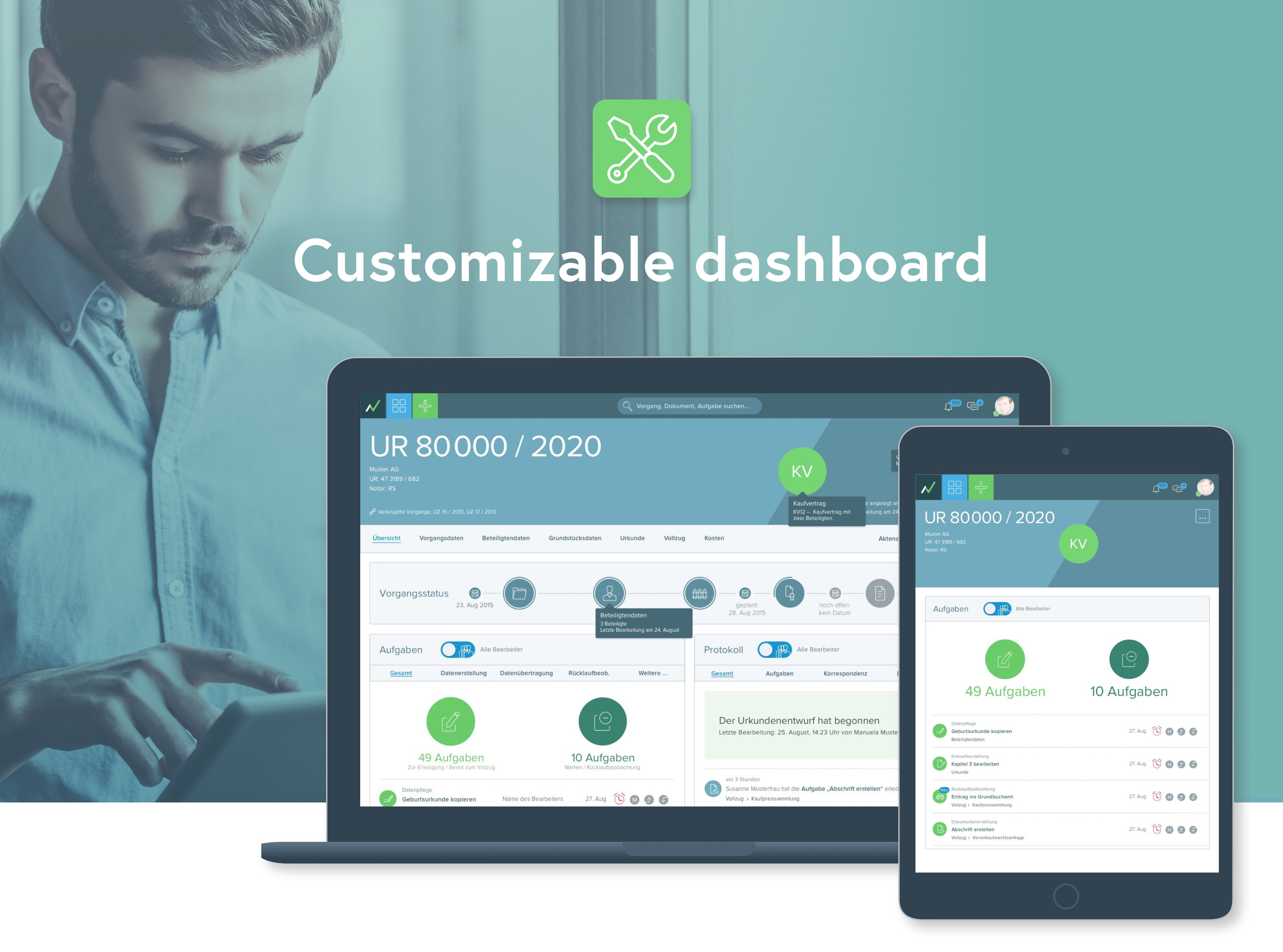
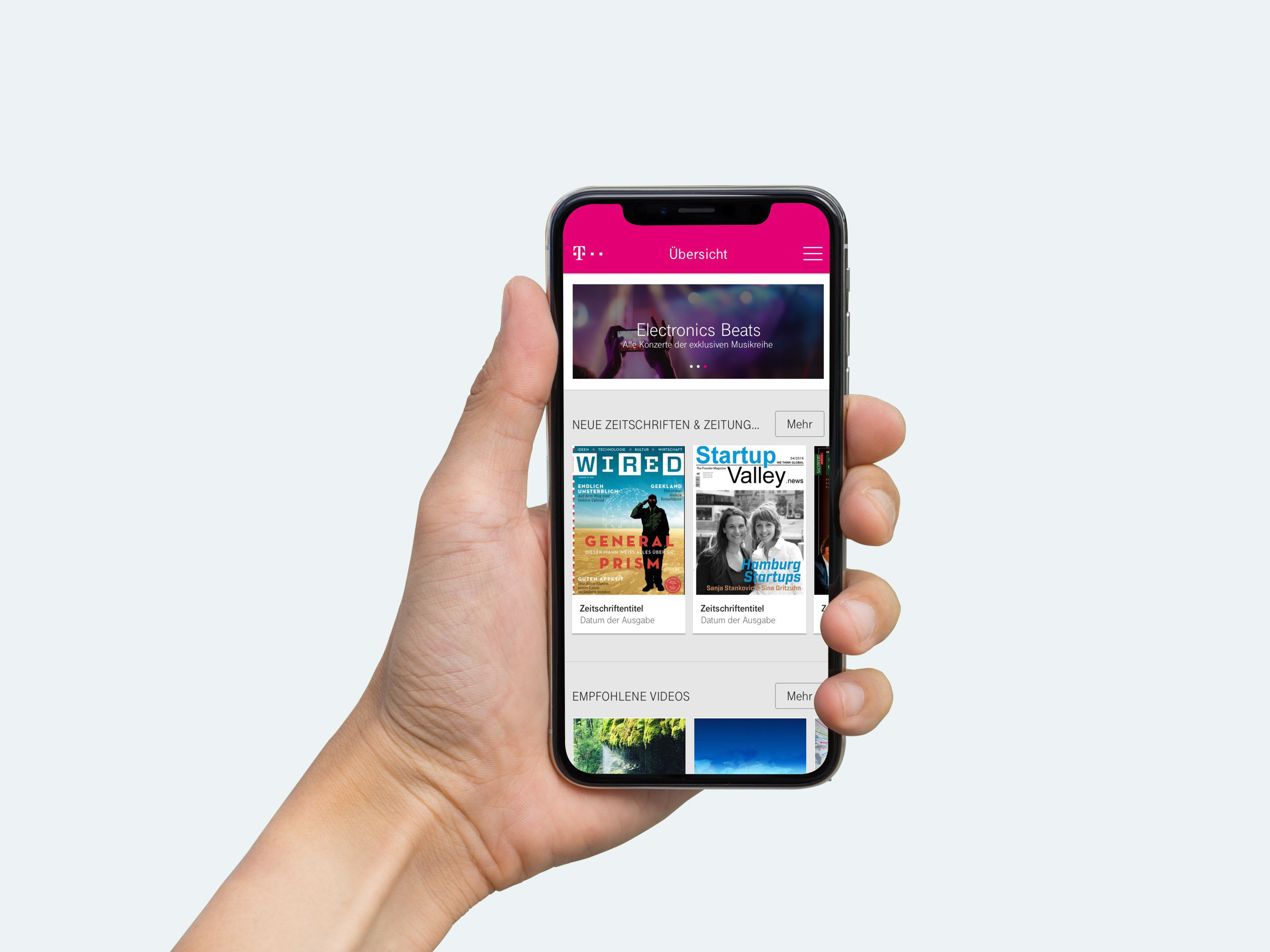
Noah is a business applications that bridges the gap between analog and digital world, bringing the benefits of digital workflows with task- and document-management, case- and client-database as well automation tools in the office routine.
Duration
1,5 years
MY ROLE
Lead Product Designer & Product Manager Frontend (Freelance)
MY TEAM
2 Product Designer
CLIENT`S TEAM
2 Product Manager, 2 Consultants, 1 Scrum Master, 15+ Developer, Westernacher Chief advisory board
PLATFORM
Desktop & Tablet
I was responsible for frontend part over all stages in the projects. I led the design team and collaborated closely with the two other Lead Product Managers. I regularly reported to the chief board and communicated with the development team.
To comply with my non-disclosure agreement, I have omitted and obfuscated confidential information in this case study. The information in this case study does reflect my own views rather than the insights from Westernacher.
The Challenge
Starting from scratch
My client aimed to fully renew the strategy of their 10 year old notary software. Starting on the green field should bring their app's functionality and usability beyond modern standards and their competitors.
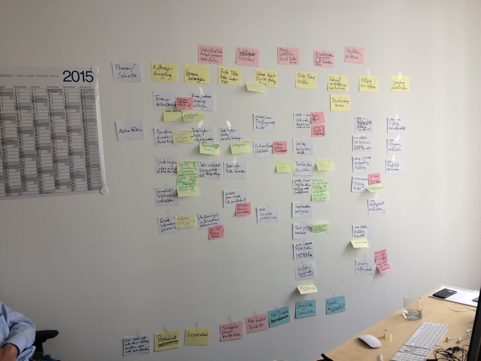
There was a fixed launching date to meet a structural change in the German notary landscape. Therefore, the backend development should begin soon with first requirements, while the product design should continue in parallel. At a first glance, the project seemed like a big black box due to the planned approach: Task- and document-management, case- and client-database as well as some other tools should automate the complete notary workflow. A process had to be setup to bring transparency into the scope and to find the right starting point for the project.
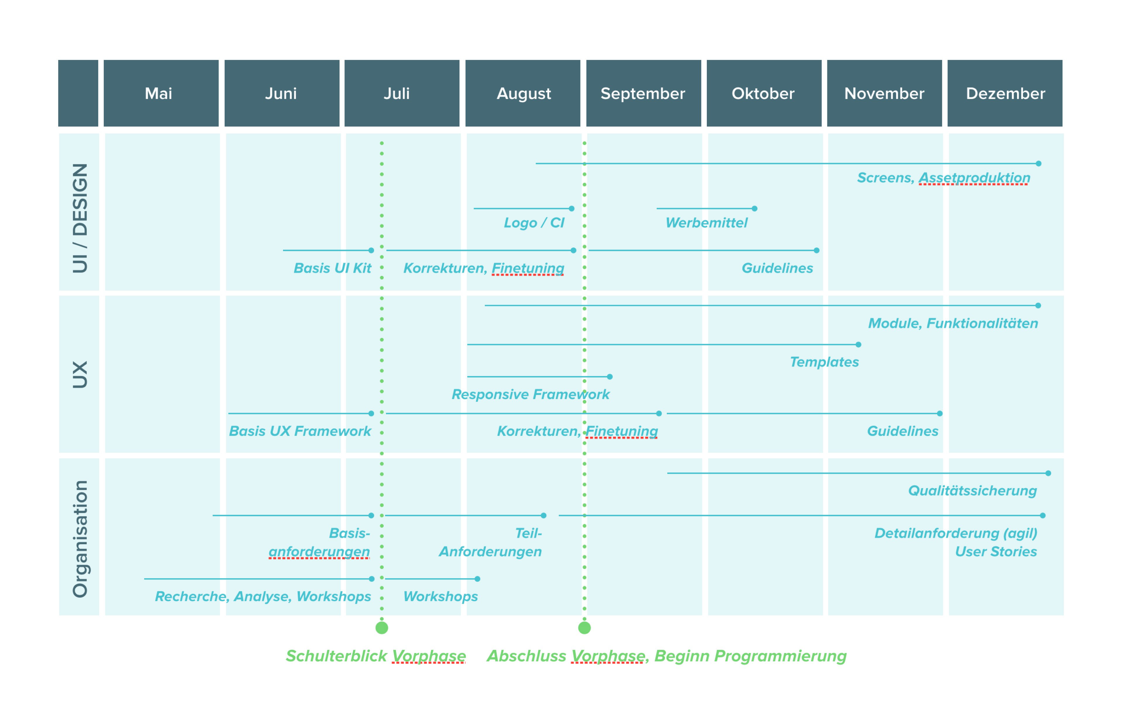
Rough project plan that I planned with project management for design process
The approach
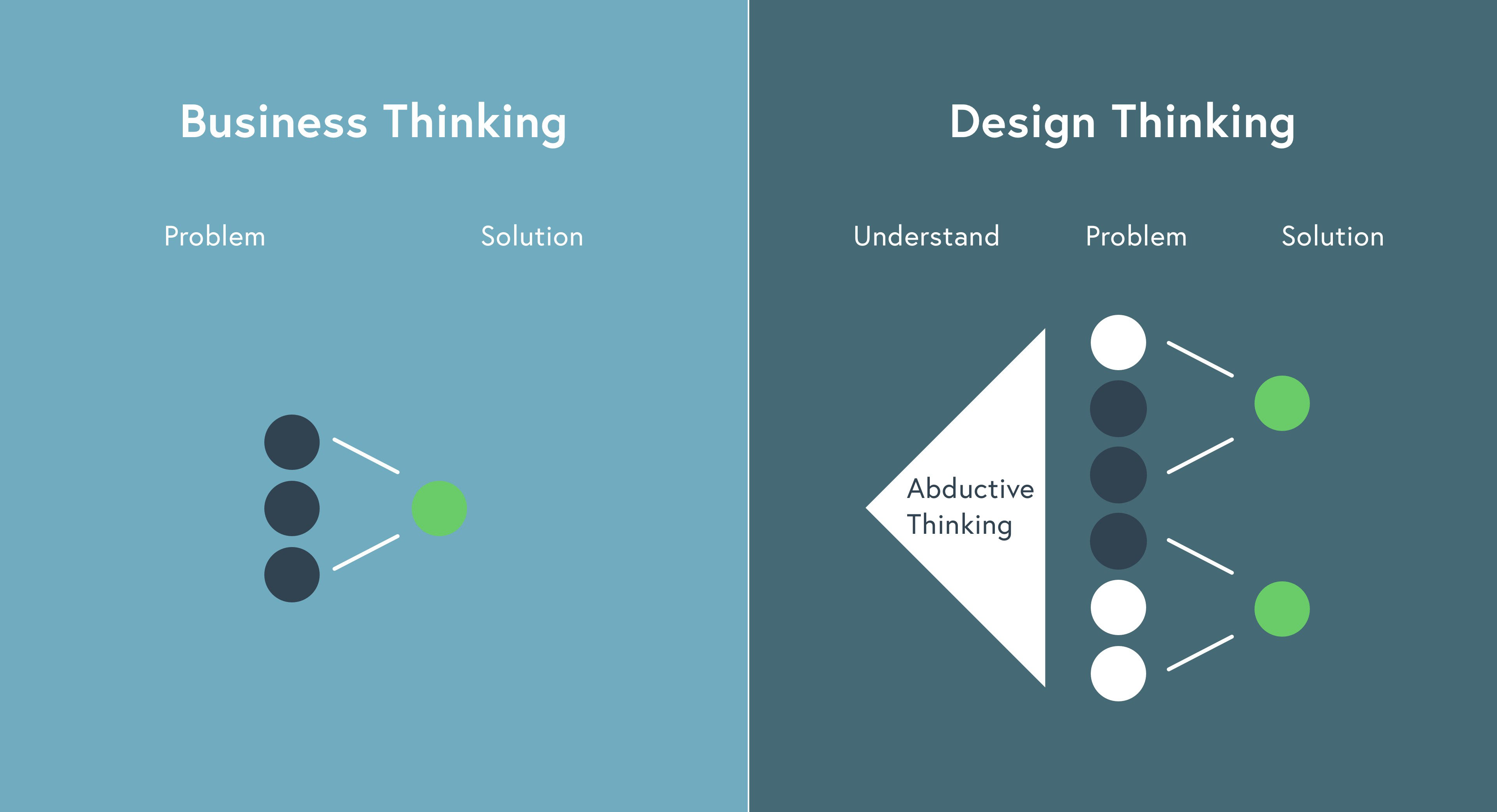
Business vs. Design Thinking
Although our brief was to develop better functionality than our client's competitors, we stressed that engaging in a feature parity war was neither strategic nor had the best interests of the app's users at heart.
To differentiate ourselves in an already mature and competitive market, we needed to define a desirable role for the app and how it would meet the needs of the scheme's users. We were thrilled by the opportunity to create something more meaningful.
Getting all involved from the start
Starting with a meeting with all key stakeholders helped us to understand the business challenges. We identified risks and aligned on expectations and constructed a shared vision for the app.
Lean UX as base for collaboration
We knew that a long development process was ahead of us. Thus it was even more important to obtain feedback as early as possible in order to make quick decisions with a lean approach. We emphasised rapid sketching, prototyping, user feedback and design mockups.
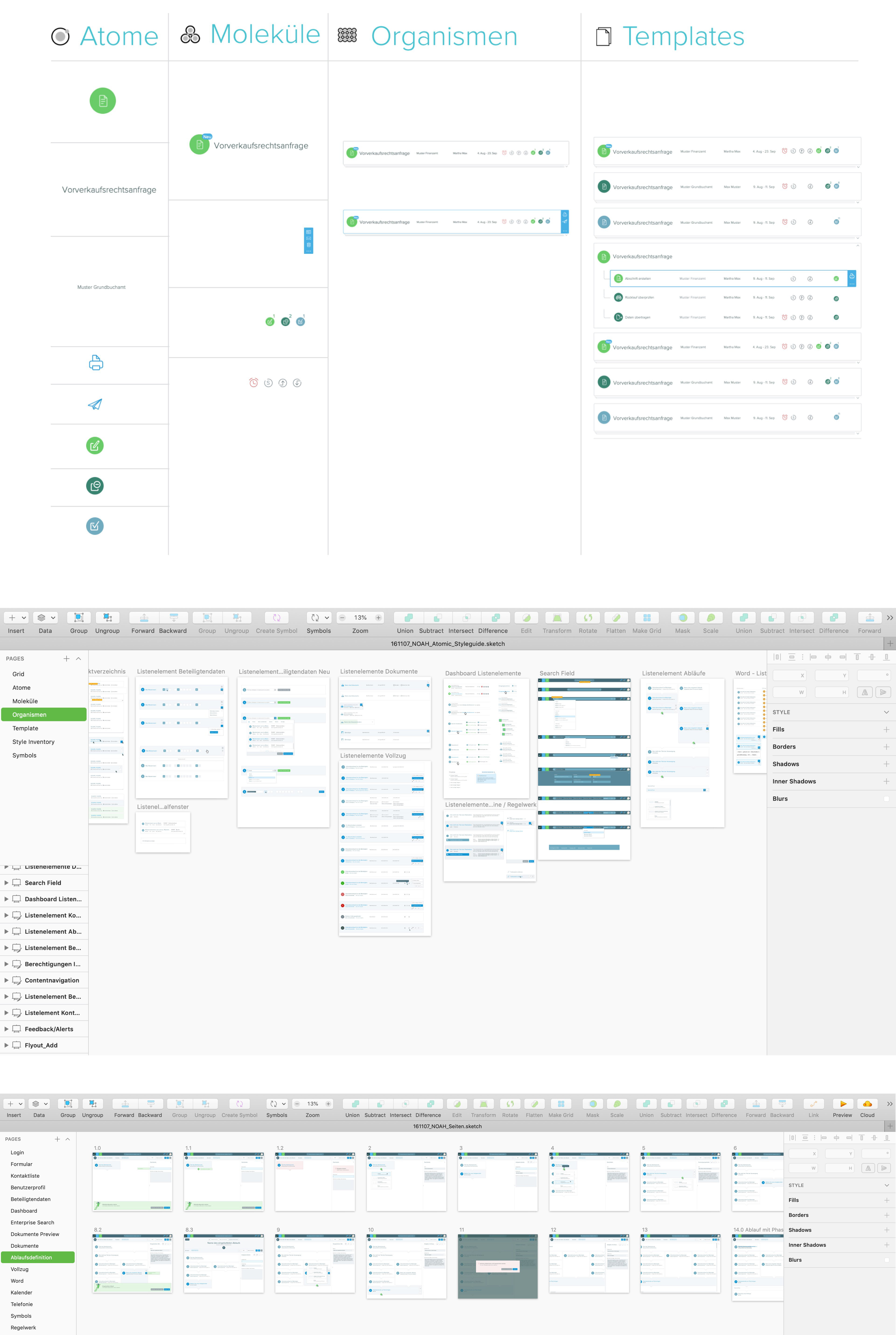
Atomic Design/Living Framework
In order to do quicker prototyping and be able to to easier change in the libary I setup the principle of Atomic Design. This procedure has later proven itself in conjunction with the programming.
The Discovery
Immerse into the complex legal processes
Since I and many other team members had little knowledge of the notary's work, we used different design thinking methods in order to understand the nature of this legal business thoroughly and quickly.
We used scenarios and role-plays to begin research into user needs, behaviours and pain points. We also explored the typical touch points and user-journeys in a notary office with the A Day In The Life method.
Our research revealed that the concept of 'handling a case' varied strongly. The customer base of the application spread wide from small- to large-sized company and from chief to intern, with a lot of collaboration involved. Also, the users' motivations for using the app in the scheme differed.
Creating empathy across all functions
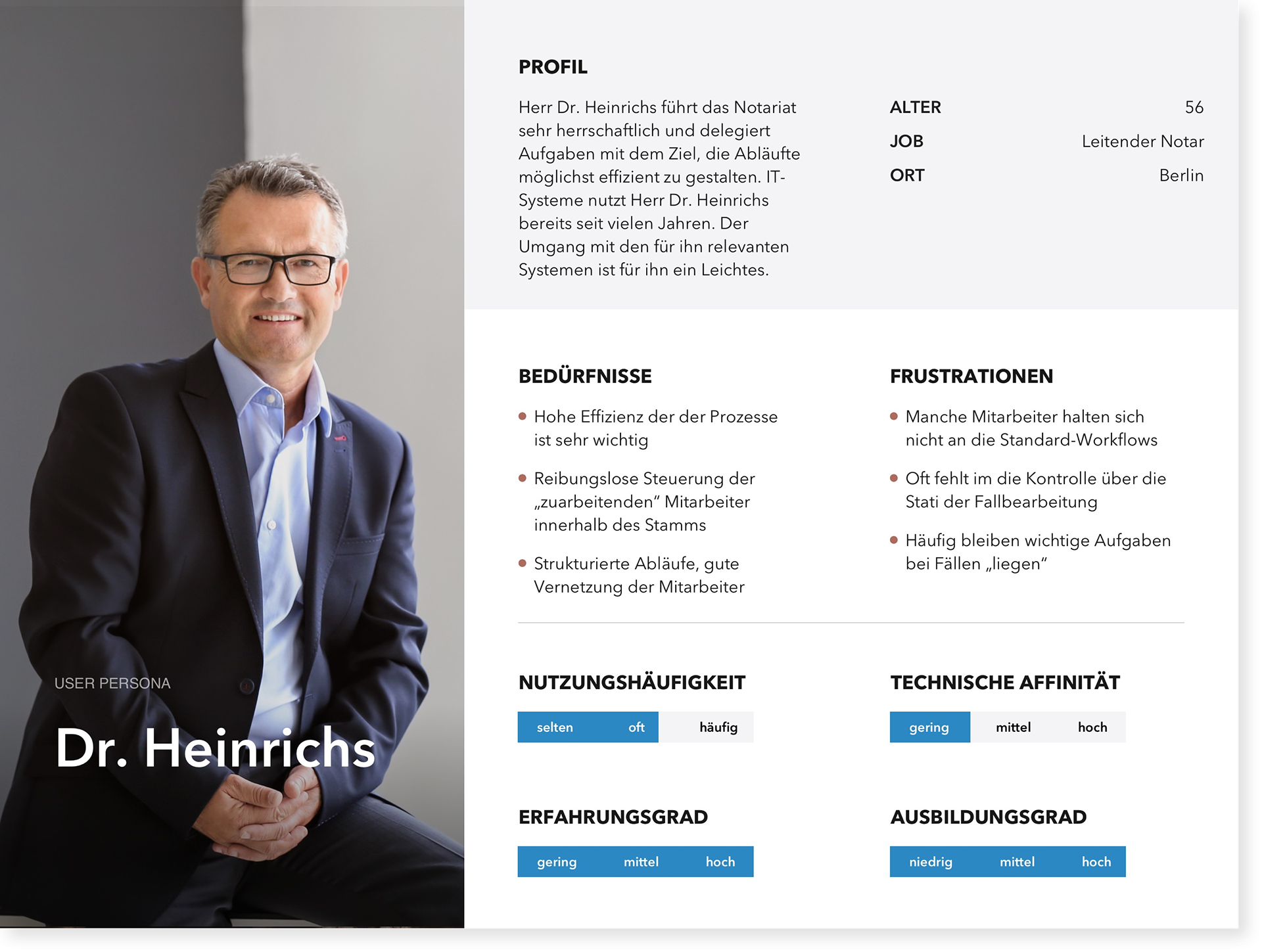
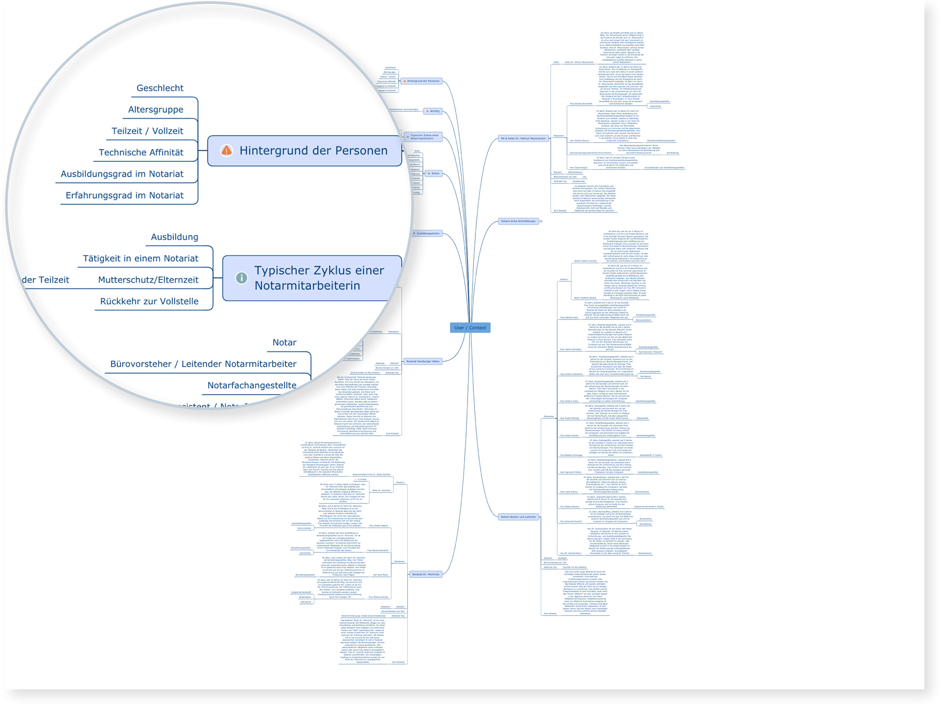
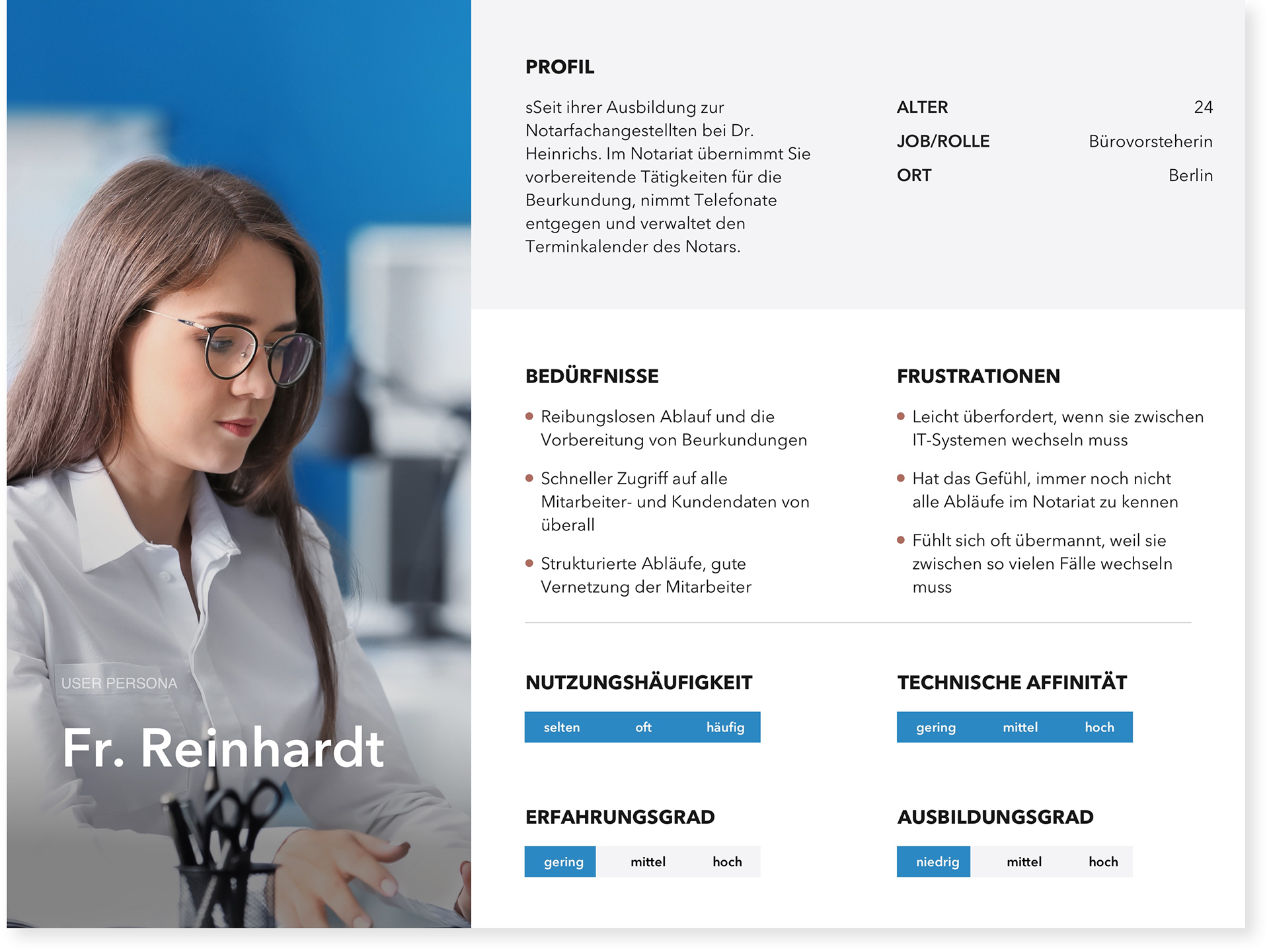
The persona hypothesis helped the team to discuss about user needs, desires and varying contexts of use.
We mapped all the possible concepts and translated this into the spectrum and scenario framework. From there, we extracted and segmented our user audience into 10 different archetypes with identified sufficient behavioural and responsibility variables.
Variables used: Frequency of use, number of tasks in the case, level of responsibility in the case, size of the company user was working in.
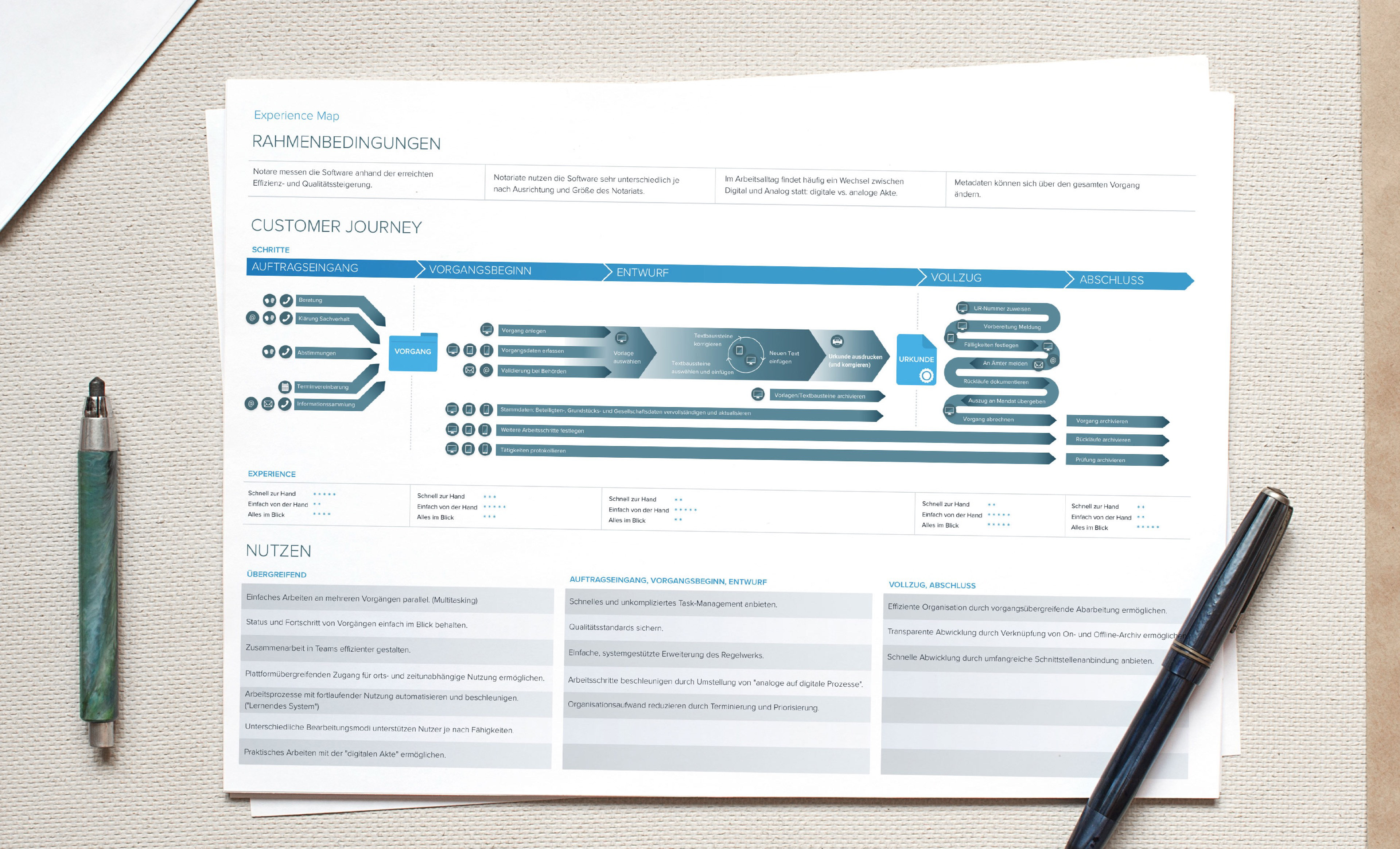
Visualising the end-to-end experience
I used the experience mapping technique to visualise and communicate the users end‐to‐end experience across various touch‐points. This allowed us to understand many of the complex processes involved and to map the workflows on paper. The overview highlighted opportunities where we could really try to innovate by closing the gap between the analog and the digital workflow and where to focus our attention in the feature design.
Creating a vision
Everything in view and at your fingertips
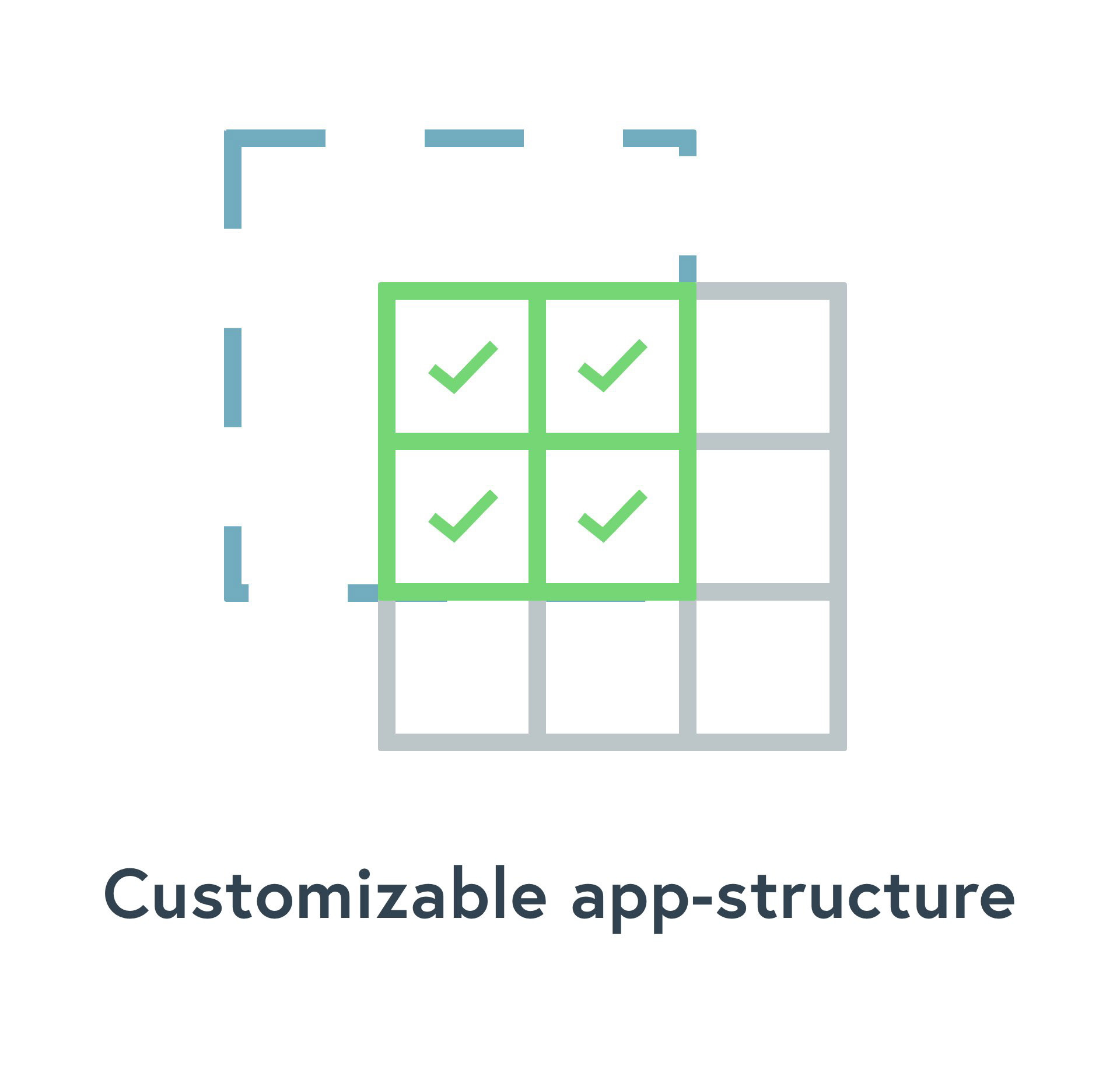
Our vision was not to create a random software (like the clients' competitors), but a solution center. An app-based, modular approach should give maximum of flexibility and adapt to company´s and user´s needs.
Brand and User Experience
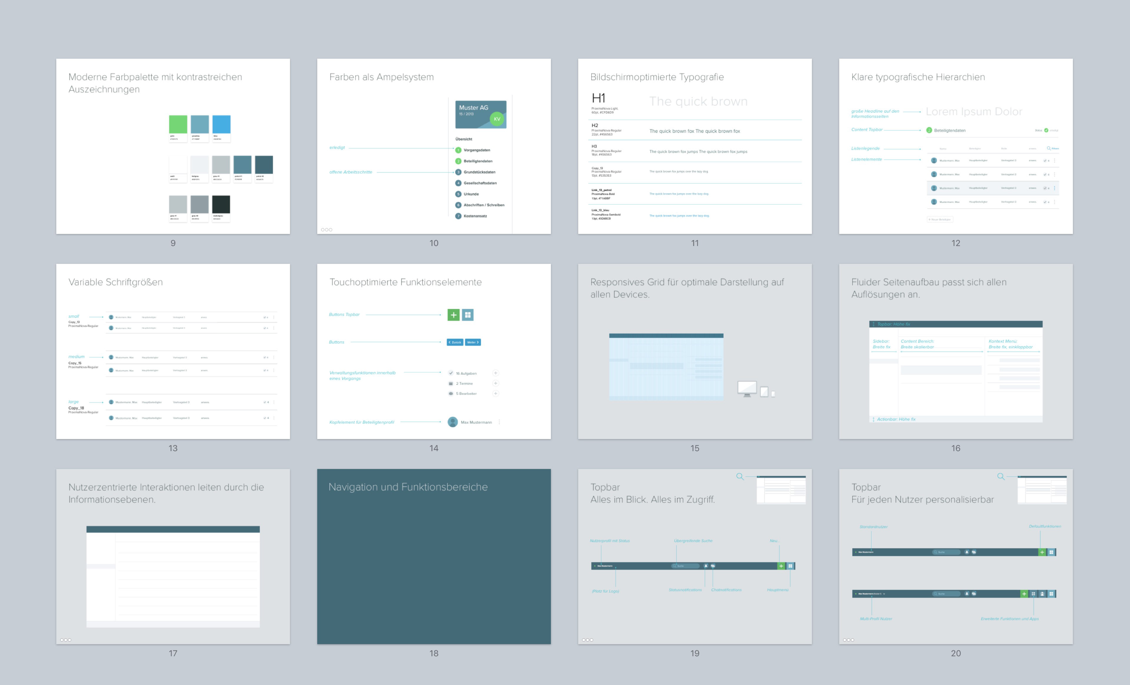
I developed a set of experience principles to communicate the personality of our app to team. These were used to sense‐check design decisions and describe key attributes the app experience should uphold for both the users and the brand. A bold and simple design system with a high distinctive and memorable value. Focus was a clear visual hierarchy for the data and high scalability and flexibility for all kind of components and platforms.
The Framework
Setting the UX direction
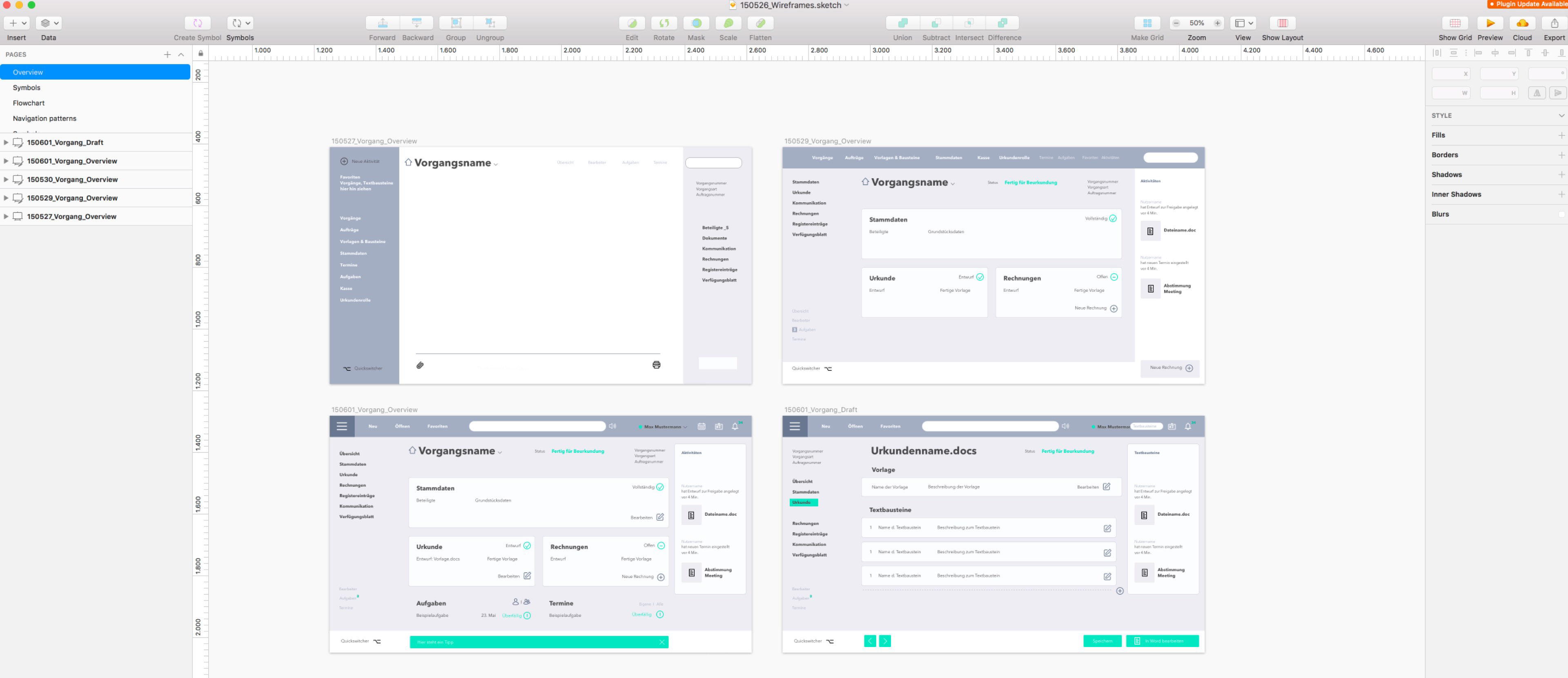
After a comprehensive research on modern SAAS trends, I started sketching and created ideas about the arrangement of UI, functional and data elements, and interactive behaviours. We took a top‐down approach to defining the overall structure of the experience. I started with wire frames, and some mid- and high-fidelity prototypes were created. First user tests with a sample group revealed improvement in the structure of the user interface.
The ideation
Designing the workflow
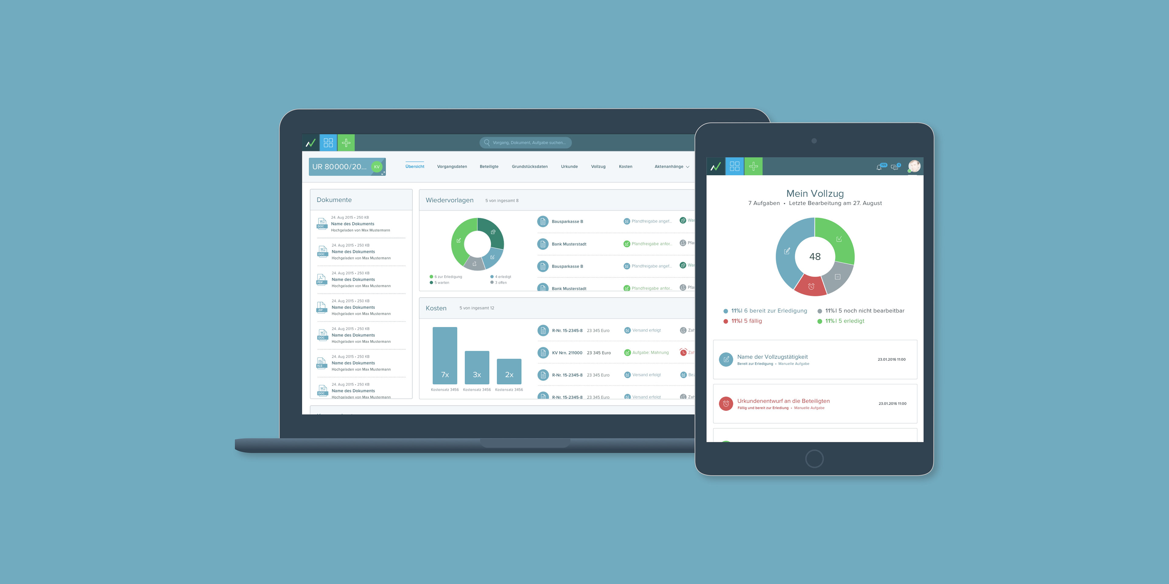
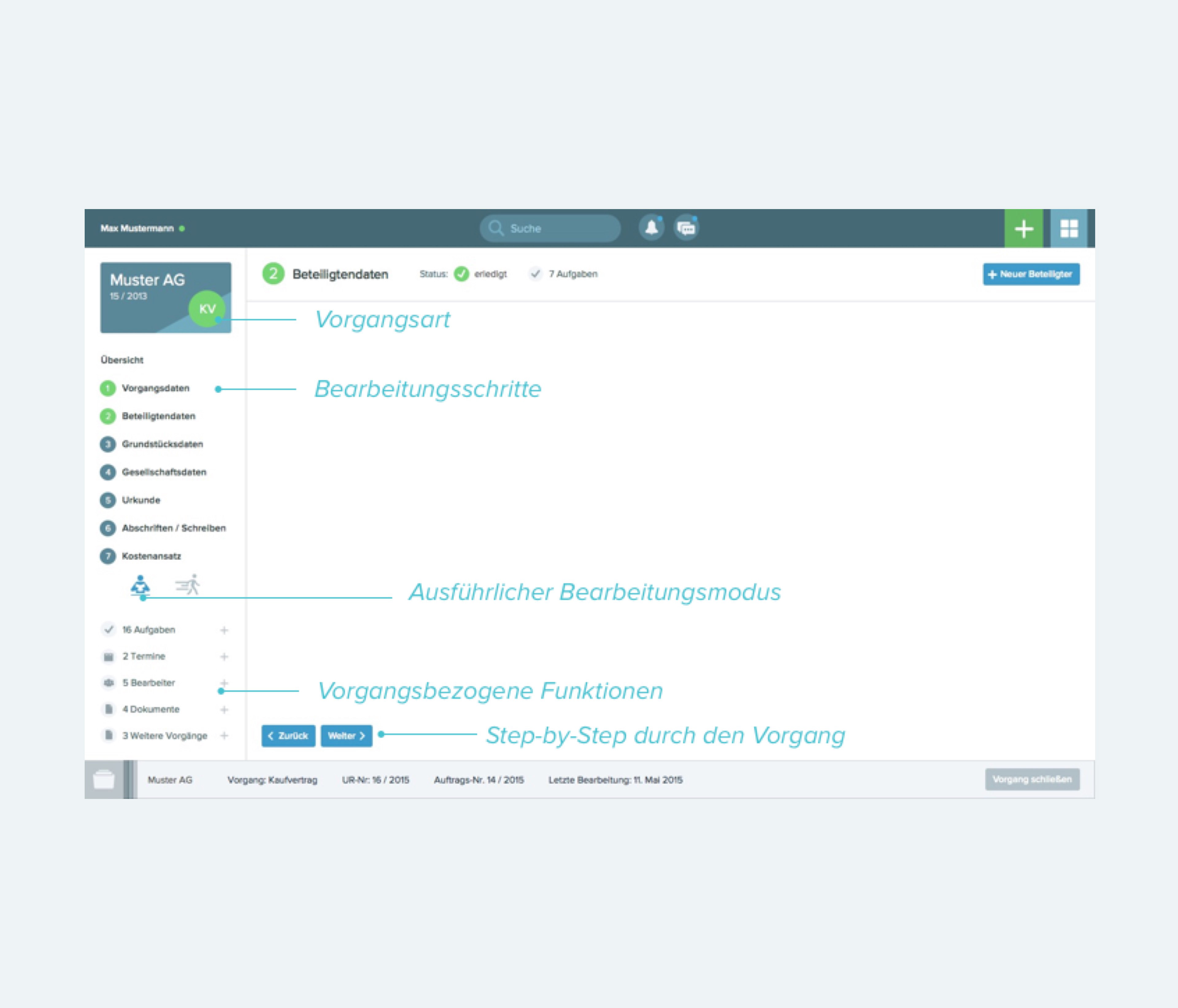
We started broadly: After identifying the main use cases in our scenarios, I defined the primary use flows through the app. Crafting several key user journeys for each personal was extremely helpful to conceptualise and structure the data and functionality. Then I looked deeper into the design language, interactions and the app's anatomy began to piece things together. I began to think about particular usage contexts and and how elements manifesting themselves in the interface would help to support the user.
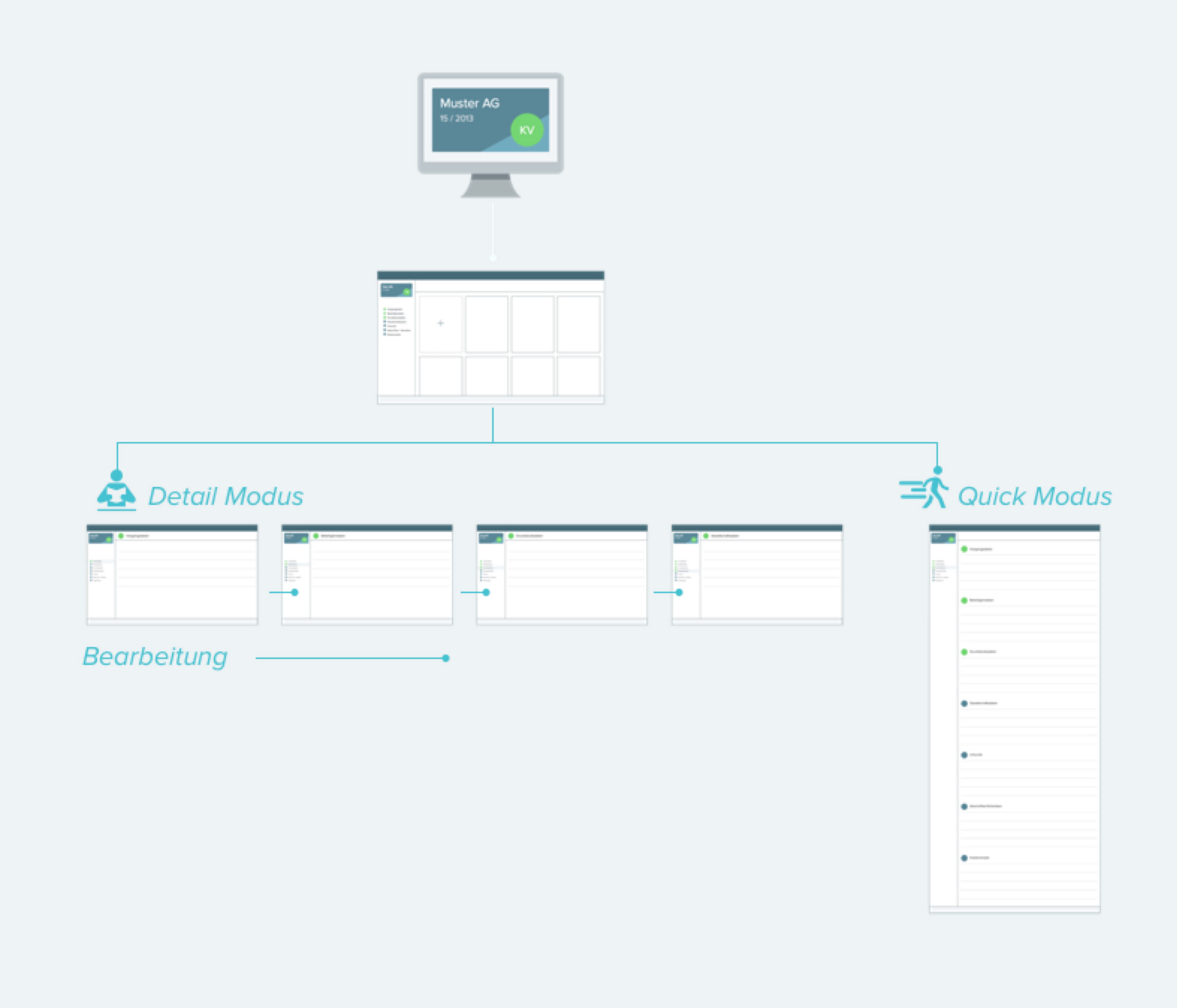
Mockup of different editing modes according to different user clusters
Mockup of the case template
Structuring the experience
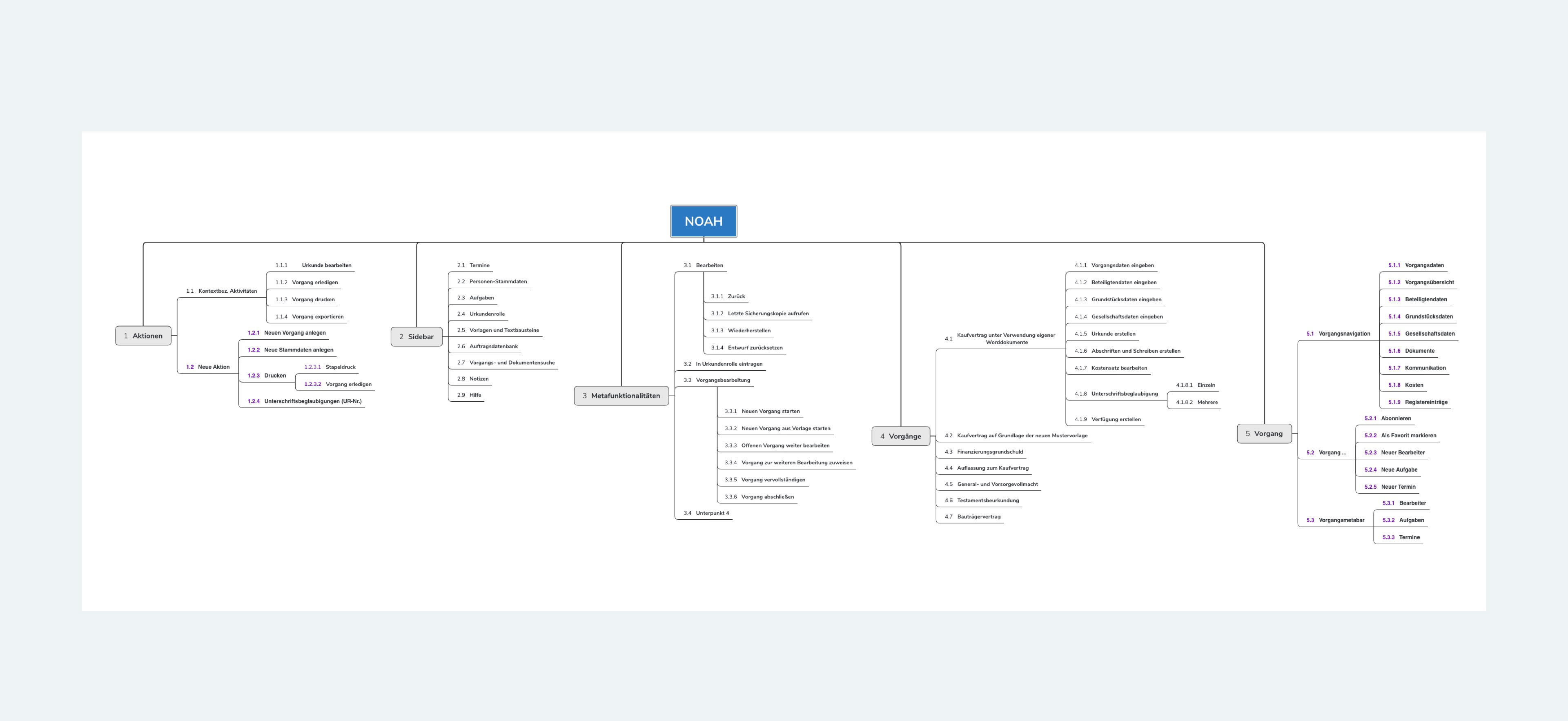
Based on the insights gained from the workshops and card sorting with potential users, I defined the information architecture for Noah and then evaluated it via tree tests.
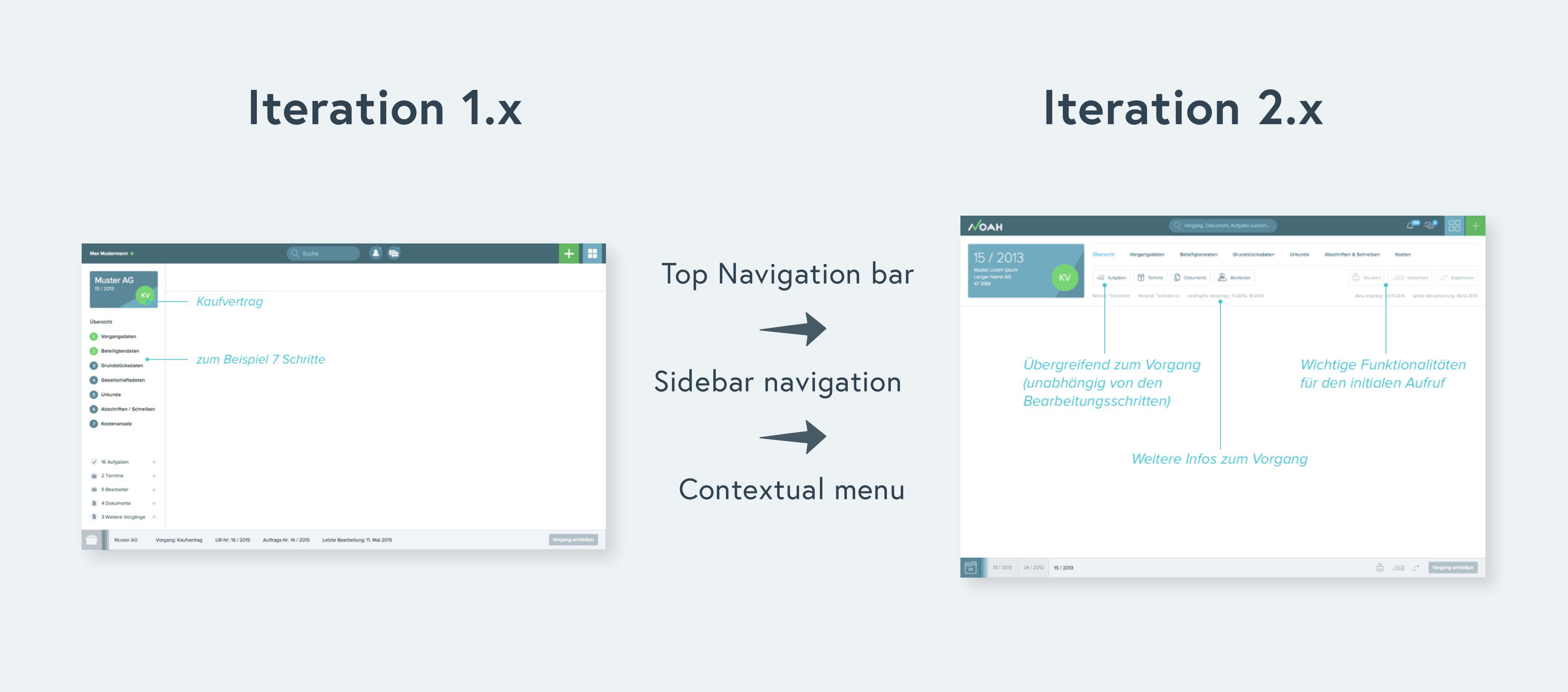
Product iterations
Now it was time to start the iterative design process. We build the first prototype, defined tasks and establish objectives in order to evaluate the app concept. We were able to find issues related to perceived affordances, layout and automation workflow. The results confirmed some of our assumptions but gave us also some valuable hints for a major improvement in the main case navigation.
Implementation
Defining and communcating requirements
Although I have agreed with my client to foster an agile approach, unfortunately, this was not always possible in practice because of the technical complex infrastructure. Heavy documentation was needed for that.
The sheer size of this project and a structured waterfall approach for technical implementation meant that often I needed to have everything figured out before teams would commit to moving forward with the work. Many teams involved in the project needed to see it in a tangible document. This risk averse mindset meant I created a lot of reference documentation. I established two design work streams: The basic UX and UI (Design System) was permanently improved and expanded in the Atomic Design Styleguide. The use flows, states, interactions and views were designed in a separate document and on Confluence.
I took part in weekly stand-ups and scrum sessions from remote and worked on the user stories defined on Jira. For each sprint I created detailed documentation for design, functionalities and interactions during this project to communicate requirements to the engineering team and support our quality assurance teams in writing test cases.
Result
Noah is a modern and easy-to-handle business applications with a flexible framework that can be customized to different use cases.