COMPANY
Doodle
about
After more than a decade Doodle had helped millions of people around the world to find the perfect time to connect. With the new Doodle, the company shifted towards an enterprise SAAS solution and planed to facilitate millions more with its outstanding calendar management tool.
DURATION
11 months
MY ROLE
Senior Product Designer & Product Manager partially (Freelance)
Senior Product Designer & Product Manager partially (Freelance)
TEAM SIZE:
1 Lead PM, 1 PM, 5 Developer
PLATFORM
Web (Desktop, Mobile)
Web (Desktop, Mobile)
I accompanied the company during a crucial part in transformation process and worked closely together with product managers, designers and developers across the company. In addition I supported the initiative to migrate the design workflow from Sketch to Figma.
Disclaimer:
After the end of my job, Doodle had a major redesign in CI. This is not reflected in my case study.
After the end of my job, Doodle had a major redesign in CI. This is not reflected in my case study.

ROADMAP goal
creating an exceptional experience that leads to actions and conversions
creating an exceptional experience that leads to actions and conversions
I accompanied the process over 10 month until shortly before public launch.
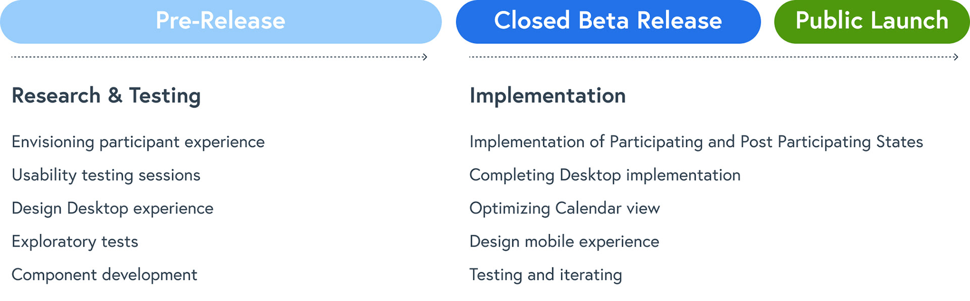
Discovery
identifying the main problems for meeting participants
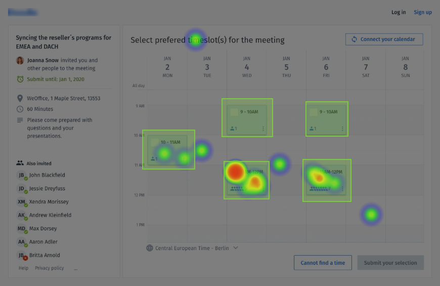
Together with the Product Owner, I started an intensive research by conducting surveys, running usability tests and analyzing session recordings.
Cleaning the data and segmenting the information
↓
Documenting the problem and the hypothesis
Documenting the problem and the hypothesis
↓
Gathering additional internal data
↓
Designed low-fid mockup that best suited the need
↓
Presented the low-fid mockup to Sales, CS and internal teams
↓
Develop and test interactive prototype
Top 3 Learnings

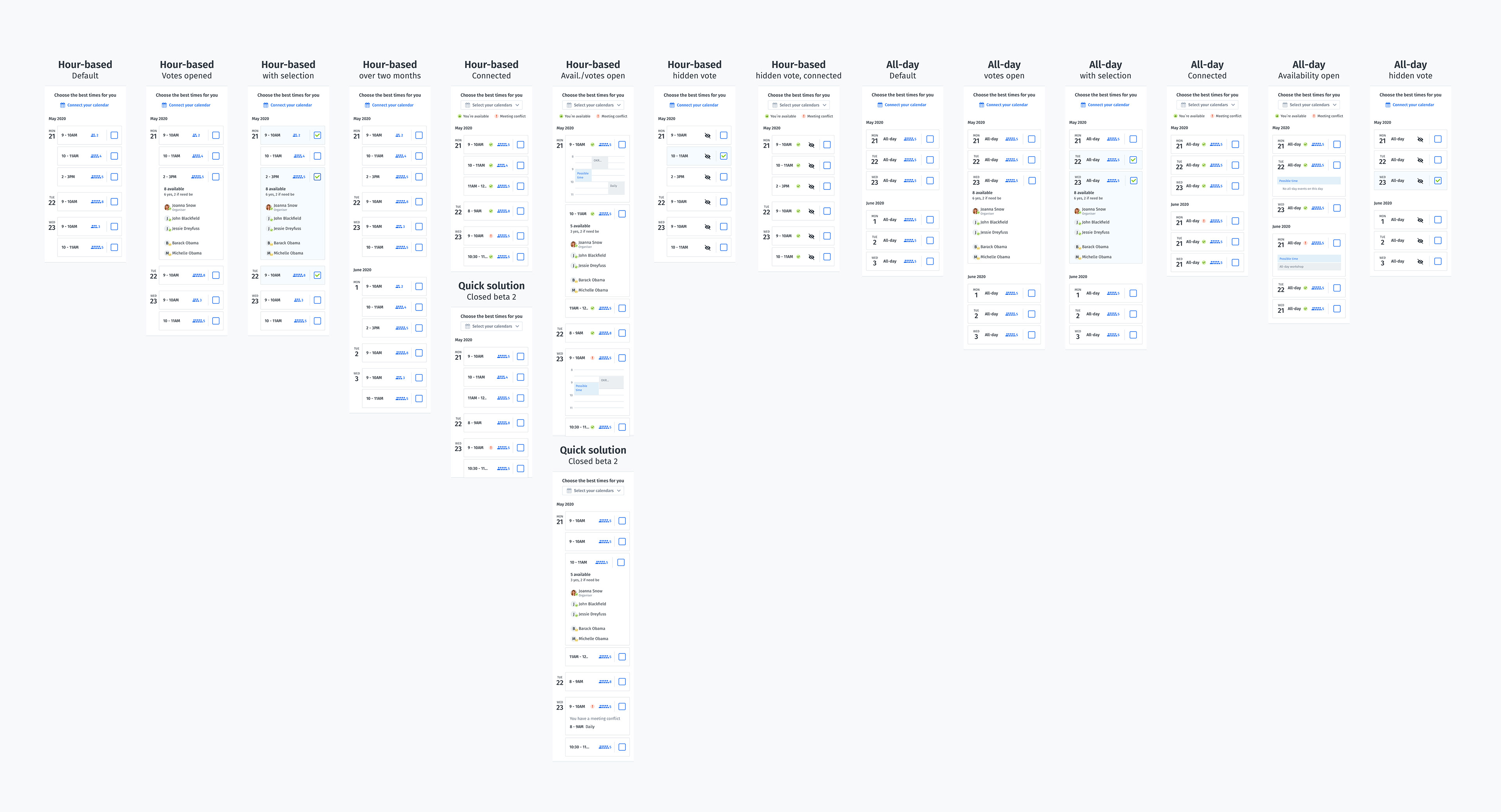
desktop experience
designing a seamless scheduling experience across all meeting types
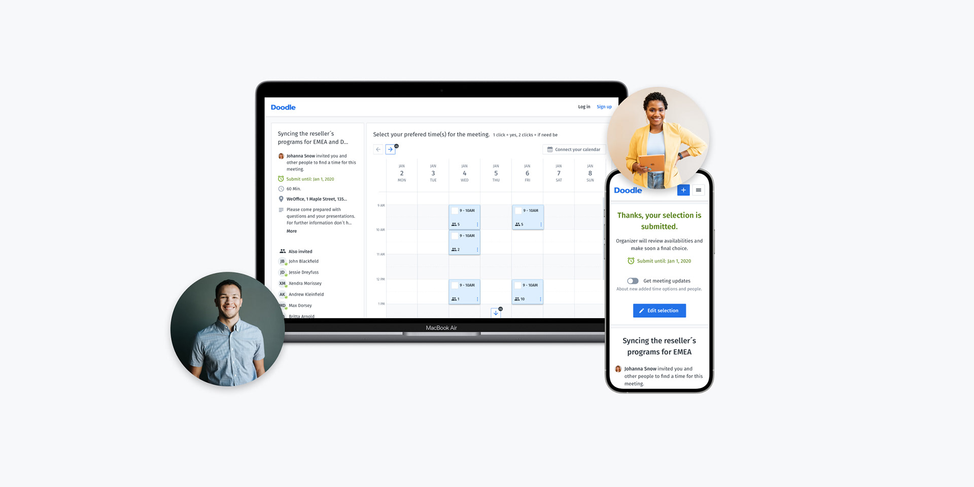
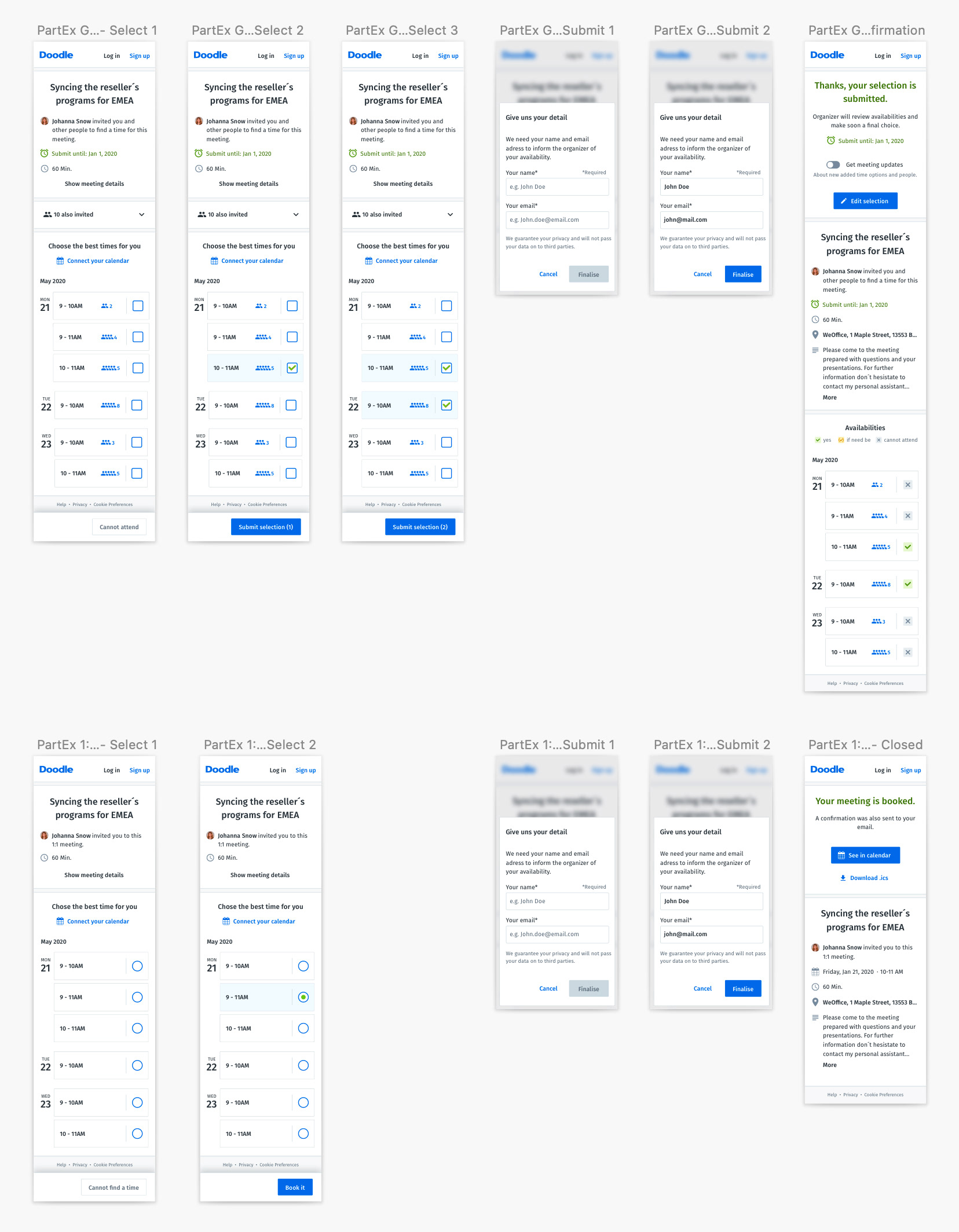
In the course of the Doodle suite redesign old product legacy should be eliminated. One of my main tasks was, to unify the flows of the different meeting types in order to provide a seamless experience for frequent users. The group meeting type was defined as the core of the product, as it covers most of the enterprise use cases. Starting from this I derived the intersection of the different meeting types and sketched the variations.

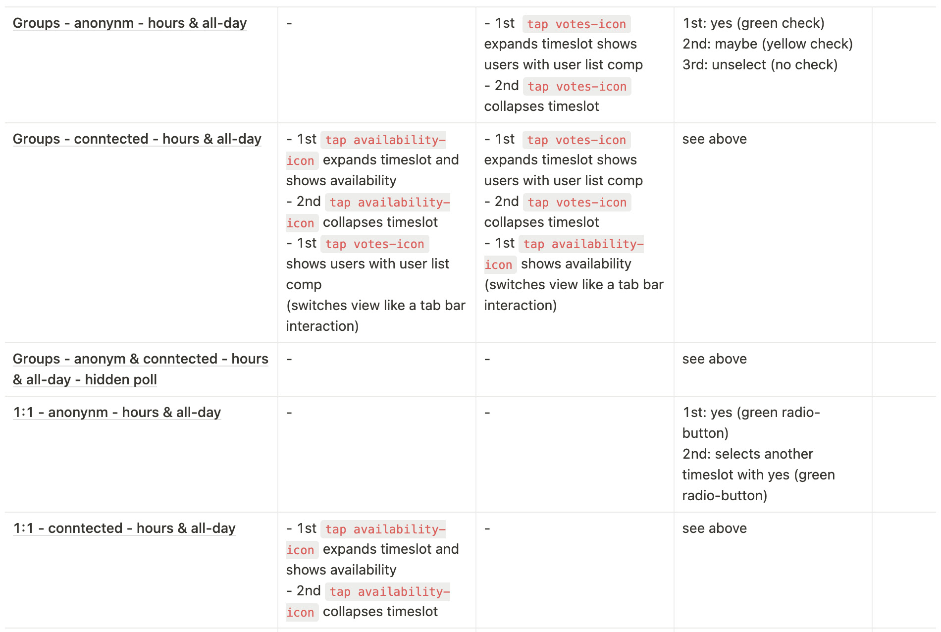
Shared components
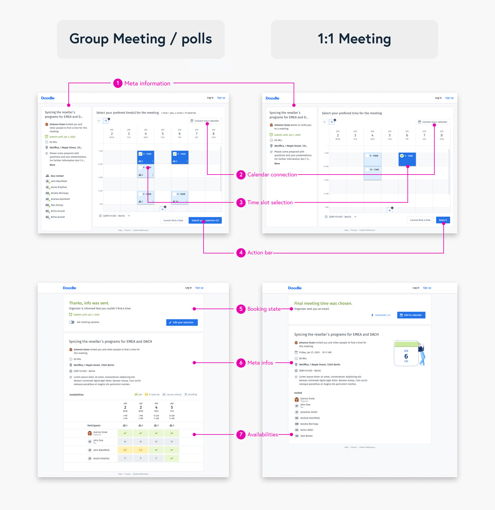
Participating and post-participating state with components
Calendar component

Calendar component
Mobile Experience
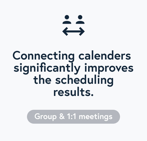
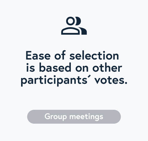
After intensive consideration I dropped with the team the calendar pattern on mobile. Since I had found out that most of the participants aligned their selection on previous participants´ vote, the focus of the mobile version was on providing a list optimal for quick scan others and own availabilities.
Usability Testing
Throughout the whole design process I regularly run usability tests on various platforms and in user sessions. I spent a lot of time on testing the multi-select pattern and the mental model laying behind the group meetings. It posed a great challenge for the design to guide users from the process of tentatively blocking various meeting options to compulsory booking a specific time.
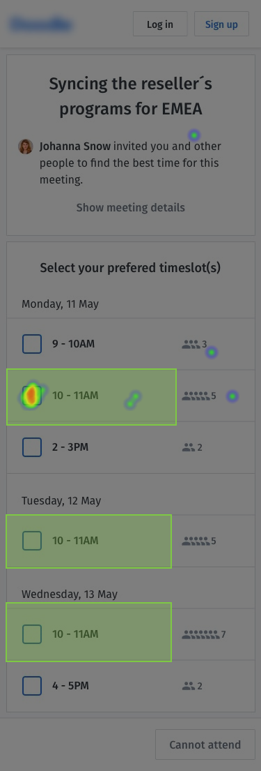
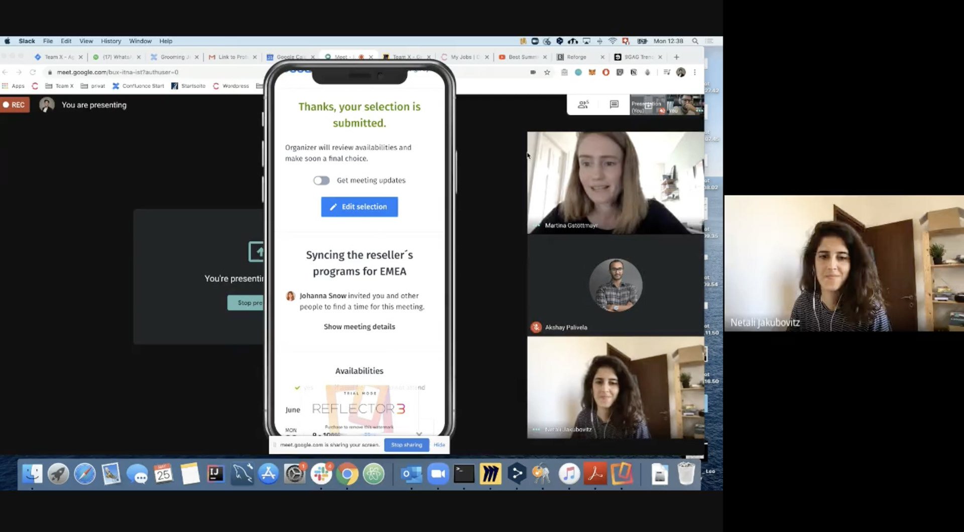
Remote interview session with mobile prototype
new design system
In the course of the product transformation, the design processes were standardized in parallel. In a cross-functional initiative a design system was developed which should build streamline upcoming design and development process. I worked closely with the other SchedEx chapters and the development team in order to define the structure of documentation and implementation workflow.
See timeslot component for mobile as an example for this workflow.
1. Start with Anatomy and Structure
Aligning across the design- and development team about shared requirements
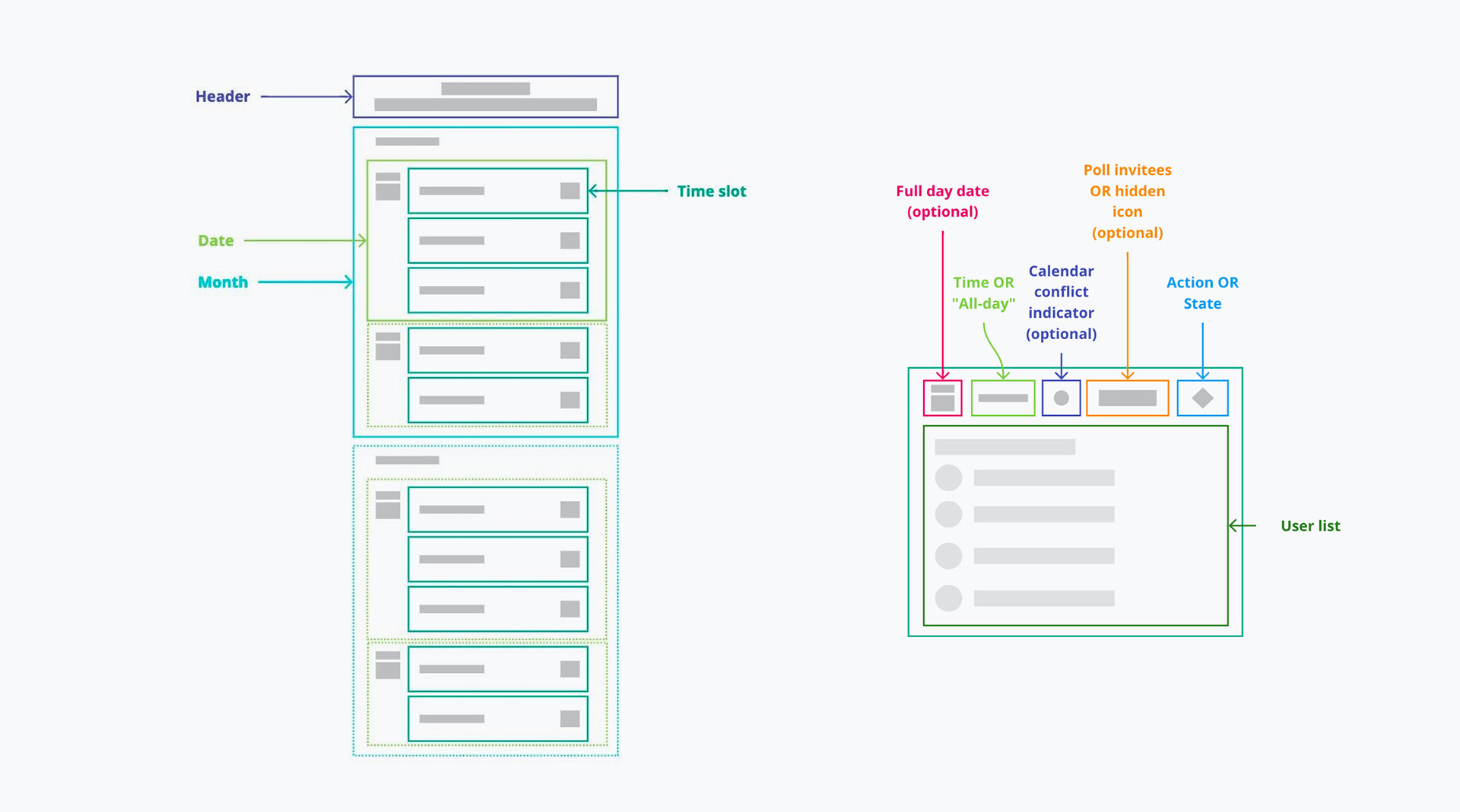
2. Design component in Figma
Specifying states and variations
3. Document on notion
Specifying all details with interaction states and ACs
Results
over +10% in conversion,
4.0 of 5 average rating
4.0 of 5 average rating